All colours of the night...
- Bertrand Mougel
- May 18, 2020
- 3 min read
“Abstraction is real, probably more real than nature.” Josef Albers
I discovered Josef Albers through the work of his wife Annie when visiting the exhibition on her patterns at the TATE Modern in 2019. Her colourful geometrical sketches were the most exciting part of the exhibition for me and I was forced to investigate further on both of them. I eventually came around.
I will focus today on Josef, however, I am compiling my former picture of the exhibition to share on this blog later on this summer.

Josef Albers was a German-American artist, teacher, print-maker and most importantly, he was a colour theorist. He studied the effects of colour and how they interact with each other. He studied and then taught art at the Bauhaus, the famous German school of art, design and architecture. He and his wife Annie moved to North Carolina when the Nazis came to power.
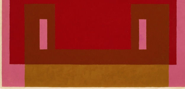
He is best known for his abstract paintings and work on colour theory, even though he also practised printmaking and designed stained glass. Regarding his abstract paintings, his series titled Homage to the Square is the most iconic as he painted more than a thousand of them. They were all the same size and shape, but what differed were the visual effects of colour and space. The variation of colour were either made of different colour, or different tone of the same colour. For instance darker and lighter yellows or light green on dark blue. This exploration is interesting as it allows to witness the effects that colours have on each other. What happens in the contrasts? What works best when combining warm colours like reds and yellows and the cold colours like blues and blacks?

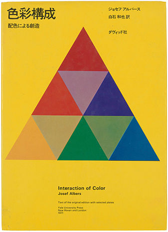
For him it was the interplay of colour that was the most important. What really brings a new light is how he showed that colour interact with each other. Colour is relative. It changes in relationship to colours around it. This is the optical effect known as “simultaneous contrast”. The colour in terms of physics and "colorimétrie" are not altered but once they are next to each other, our human perception changes them.
This makes me think of my University reading of Merleau-Ponty and his book on Phenomenology of Perception. But Merleau-Ponty was more interested in the behaviour of colour, he suggested that each colour is naturally connected with a specific way of behaviour.
“Red and yellow are particularly productive of smooth movements, blue and green of jerky ones. --- Blue is that which prompts me to look in a certain way, that which allows my gaze to run over it in a specific manner”.
Away from this digression and coming back to the passionate Albers. I am still discovering the importance of his work and his enthusiasm for all sort of subtle visual observation. A silent video on the amazing Albers Foundation website (albersfoundation.org) shows him teaching students about oblique, in the most peculiar and fun way.
Coming back to colour, he suggested to the student to imagine what colour would be result of 2 colour combined. Instead of mixing them on the palette.

He also taught on the spatial illusions of colour, how a colour overlapping another may seem to be below or above depending on the tone. And furthermore how to find the right transparency of a colour overlapping a texture.
One more magical teaching I discovered recently is his talks on the Bezold effect, which is the effect observed when changing only one colour in a picture, which changes the whole understanding of it. Or the proportion of a same colour in different texture. I look forward to experimenting with the Bezold effect on the Riso machine we have in college. Would the virus thing be over and done with.
As Peter Broderick said,
“All colours of the night turn every darkness into light”.
In those dark times. I would like to play with colours.
Josef Albers experiments and teaching give us an amazing set of palette and colour scheme to explore and maybe apply to our own colour scheme. But as he teaches, I should do my own experiment to find my own discoveries. I lately explored his work to create the colour scheme of the logo for the Climate Fringe logo.

(All pictures featuring in this page are taken from the albersfoundation.org website)

Comments