Branding: M/M Paris designer duo
- Bertrand Mougel
- Mar 16, 2020
- 2 min read

Updated: May 19, 2020
I will stay on the French side for this second blog post! Mathias Augustyniak and Michael Amzalag aka M/M (Paris). Their works have been part of my graphic design landscape for a long time and I only realised it recently.

M/M paris is a French agency established in 1992 by They create “communication, image, design and spatial strategies”.They designed film and theatre posters, published art books and catalogues, directed fashion campaigns and magazines, developed graphic identities and designed interiors and products.
Björk
I discovered their work before social media existed, through the album covers and art works of Icelandic singer and songwriter Björk in her album Vespertine in 2001. Their contribution to Björk's visual continued ever since for the last 19 years. It is only recently that I discovered the wealth and extent of their work in editorial design, art exhibition, fashion and branding.
Augustinyak said in an interview for Dazed in 2015,
“I think each album of Björk is like a presentation of a musical world played by a character she has invented.”
They created a complete visual world with its own materials, typography, graphic style, illustration, working with photographer and fashion designers. Through their relationship with Björk, she became an icon, an artist, a woman. Each album developed a new system of signs, visual language, superhuman masks and body shapes.

They combine photography, typography, 3D design, drawing, illustration and collage, etc. A profusion of designs that never fails to amaze me. Their style is unique, consistent and embedded in my understanding of what a cool design should look like.
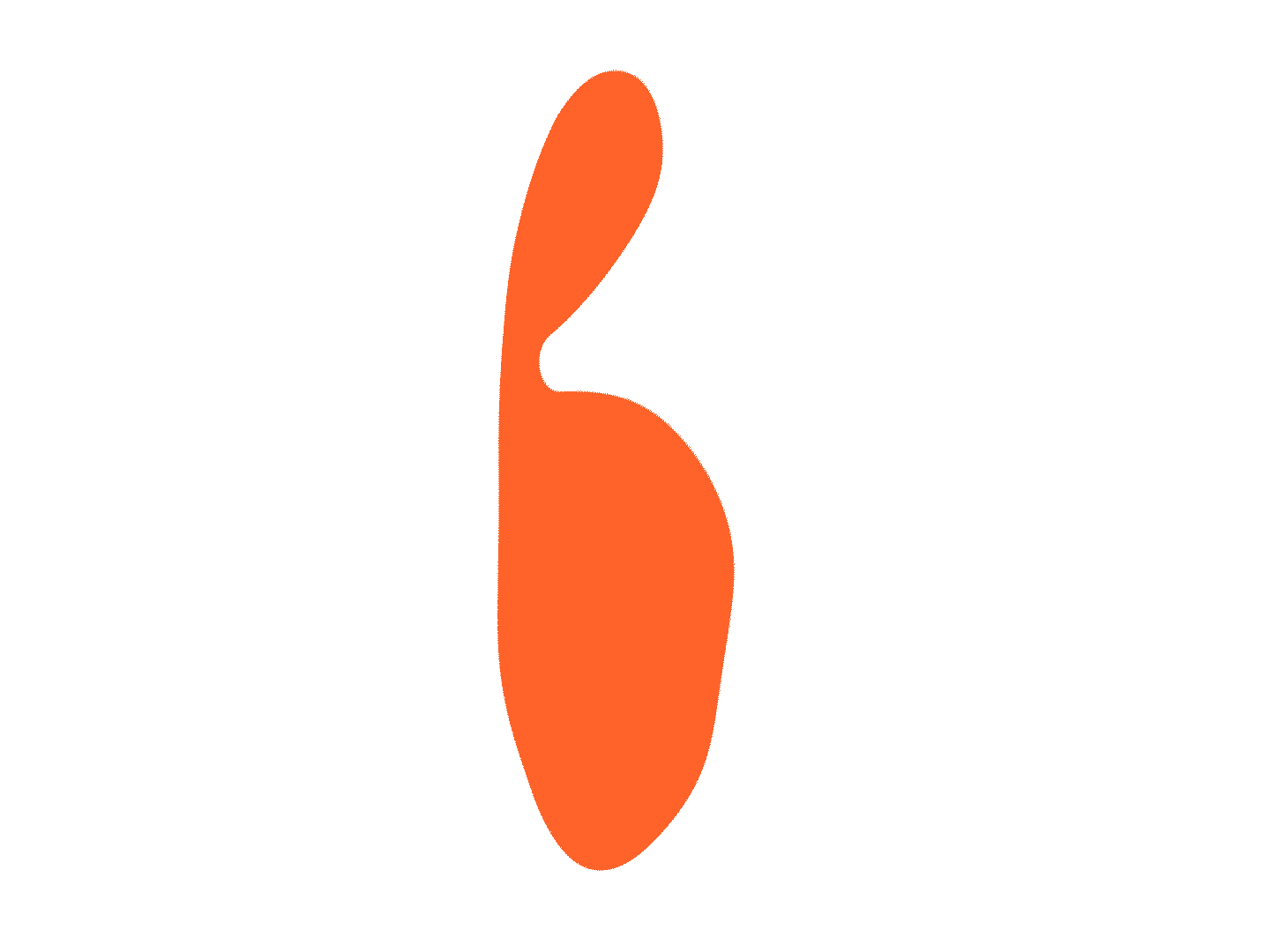
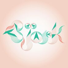
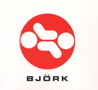
The side I knew the least about from M/M is the branding and logo work they did from Art centres, Jil Sander, Madonna, Calvin Klein, Composite Magazine, Purple Fashion, Bjork 1.0, Bjork 2.0, Bjork 3.0, Bjork 4.0 , etc...
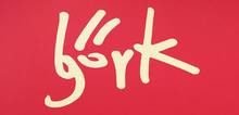

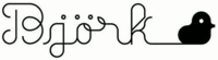


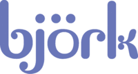

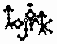
Here is a break down. What we notice from the evolution of the logo style and typography is that she started with an angular incisive and forward going type. It then became more and more something organic, modular, curved with variation of thickness of ascenders and descenders.
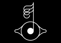
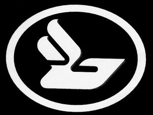
They all are type based except for the Biophilia logo ( sort of sixteenth note coming out of the pupil of an eye.)
They went from a very minimal outlined script type to more and more elaborated baroque type. To me, her latest logo (top) combines the complexity of the natural world she is so fond of and the lines of electronic circuits and knobs of synthesizers.
Comments